13 November 2006

First of all, it scores as an acronym: SOFA

Perhaps the most difficult thing about SOFA seems almost entirely ironic; there's too much to see there. Another year brings THE THIRTEENTH ANNUAL INTERNATIONAL EXPOSITION OF
SCULPTURE OBJECTS & FUNCTIONAL ART: SOFA CHICAGO 2006 NOVEMBER 10 - 12.

The place to be this weekend was Navy Pier's Festival Hall, where thousands of objects were on display for the throngs of people who attended SOFA, and what they found (other than absolute over stimulation) was probably something similar to what I discovered.

How enjoyable is to be in the company of strangers who are as equally excited about being somewhere? And how much more enjoyable is it when you realize it's not the latest Will Ferrell movie (not that there's anything wrong with that), or surrounded by screaming fans of the latest boy band, or even a sweltering day at a theme park like Great America? I know I don't have a lot of faith in humanity as a whole, but the people of Chicago surprised me this weekend at SOFA. Not only were they cool appreciators of art (some of them were almost works of art themselves), but we had to STAND IN LINE to PURCHASE TICKETS to enter the show. And upon entering, our dreams of languishing from booth to booth at our leisure quickly faded.

So next time SOFA rolls around, I can assure you of this much, the people are almost as enjoyable as the objects.

Now, about those objects.

I'm sorry to say that due to my complete overwhelmed state I neglected to write down any of the artists’ names or names of pieces that I enjoyed. Rest assured, they know who they are. And you must rely on my excellent descriptions of their handiwork as representative of their personage.

First of all, let me say at word about the pieces in general. While very few things caught our selective eyes, I must say, it was quite impressive just to see all of the pieces and consider the vast hours of work, sweat and thought that went into each piece. Seriously, the level of craft and labor was exceptionally high. That fact was prevalent everywhere you looked and you could feel it weigh you down as you walked in the door. This was not just some art show, this was serious art.

The Objects that Linger in My Mind’s Eye:

Marble busts, chiseled in homage to greek mythology and cubism. Surprising, simple, clean, striking, they were whimsical and beautiful.

The daintiest china you’ve ever seen marvelously lit to show its translucency, with elegant and delicate patterns painted on. It would be like drinking tea out of an eggshell.

Ceramic cubes with different color glazes set in a grid.

A modern Chinese scabbard with detailed metal base, two glass pieces with a beautiful photographic image above which a sword rests.

Intricate and tightly strung beaded representations of fabric from the artist’s sentimental collection. A mod, square pattern was exceptional both in concept and color.

A beautiful cabinet with rounded corners, made with different types of wood to give depth and texture.

Pastel ceramic impressionistic flowers laid side by side on a metal grid.

Giant glass paperweights with precise and symmetrical patterns embedded. One was a pink lotus, I think.

Elegant figures with arms folded; I especially liked the brick path that leads up to the figure’s chest.


SOFA is an experience worth the effort and time. As an artist, it is a way to assess what trends are getting noticed (I observed my own interests: collage style, symmetry vs. frenzy and a mixing of mediums and supplies). It is also a way to assure one’s self that there are many other people out there in the world doing things that inspire others. You can easily be one of them. It is just a matter of doing the work, making the objects and finishing the pieces.


13 September 2006

fall gallery walk 06

Another fall season kicks off with the annual River North Gallery Walk. Always a pleasure, the galleries open their doors to the general public with offers of wine and fresh art, and this year, like the last, we came in droves.

For some reason, your intrepid reporters lacked the capacity of last year and we only chose our most favored galleries to view. Isn't that always the way? Our first stop and must see for yours truly was the Martha Schneider Gallery. The photographer Lalla Essaydi in the main gallery further explored the themes of parodying statues, using text (all over the subjects and background) as a way to explore the rewriting of life itself, and the feminine figure covered in cloths in the Eastern style. Though this work was quite brilliant on a number of levels, it lost its appeal in its sense of repetition from piece to piece.

The Marx Saunders Gallery shares a hallway/stairwell/entrance with Schneider but nothing else. Inside, the cast glass nude torsos of women by Stephen Weinberg were absolutely breathtaking. Weinberg uses an ages old technique with glass, so frosted and yet transparent, it feels like a chunk of sea glass one was lucky enough to find in the sea. Weinberg does best with outright nudes where the sinewiness of the model's body comes through, but his vision fades with the inclusion of bra and panties on one of the torsos. The classicism associated with the work simply dies when you realize the set might be Victoria's Secret. As in most of our gallery visits, we always adore the work the gallery owners represent full time or can't bear to part with and keep either in their offices or in other parts of the gallery. We loved the whimsical glittery mosaic figures of Keke Cribbs, which were mirthy enough to fit in a child's room, but frenetic enough to set an adult's imagination awry.

Our next stop was Habitat Gallery which was featuring glass marionettes by Simon Maberley. This work was simple yet sophisticated, whimsical yet serious enough to place in a law office. The color and position of the glass figures changes from piece to piece which kept the work lively and not stagnant when viewed as a whole. Our blog's creator was taken with some sculpture work that played with metal, glass and shapes. One looked like an egg with the white dripping out, while another looked like a misshapen tear drop. A Dave Chiluly painting hung in the back office area, which was the most surprising thing I saw that night. It was just a piece of paper splattered with different bright, bold colors and four distinct circular shapes that looked spray painted and could have been anything, pitted cherries, bowls, globes, and yet, it was obvious that Chiluly had done this piece, even though this was not a glass sculpture like those he's famous for.

Our next notable stop was the Perimeter Gallery where we viewed the abstract nearly metallic landscapes of Janis Pozzi-Johnson. These works lacked a defining something to fixate on, but also had quite a soothing feel about them. In the downstairs gallery, sculptures by Neil Goodman took us for a turn out of the ordinary. His sculptures were all free standing pieces that seemed to rely as much on physics and geometry as artistry. Reminiscent of radiator piping, these pieces had so much craftmanship that it was nearly painful to view.

We squeezed into the Jean Albano Gallery to view "Family Treetment" by Wirsum-Gunn. The outstanding pieces were the line art paintings that had traces of graffiti style and held a futuristic pop-art style. This work was vibrant and delirious, like a drug-induced vision or dream.

Next, we headed to the Andrew Bae Gallery to view block art prints of photography through a very innovative process by Tetsuya Noda. The show was appropriately titled "Diary, uncovered" and as we wandered through the pieces, which were striking, somber, and amusing at times, it did feel like we unearthed information about the artist himself. Through use of mimeograph machine, Noda scans his photographs and then creates a wood block for printing. The images have a dated feel to them, despite being less than twenty years old. Each piece tells a story. In its entirety, it felt like we were leafing through an old photo album littered with the remnants of life we can't throw away, postcards, receipts, pictures of almost nothing important.

Last but not least, we made our final stop at the Lydon Fine Art Gallery which was featuring the ethereal, abstract landscape work of Tracy Lynn Pristas. What Pristas does best that other artists working in abstract form lack is the ability to gradiate pleasing colors so minutely that you feel as if you are glimpsing the work through a prism. Also, Pristas plays with layers of paint for contrast to the eye and in some of the pieces, like "sun light dance," she uses this technique to focus the viewer's eye to the shaft of light that is in all its glory on the canvas. Trevor Bell's unusual sloping canvas and bright bold nearly solid color paintings are still being represented, a true testimony to the word "fine" in Lydon's claim. More modern than most of the work they represent, Bell's pieces are big and cannot be denied as excellent.

There are more galleries in Chicago than one can account for, trust us, we have tried. And yet, what makes the River North Galleries special is that they continue to search for what is pleasing, surprising and fresh. You can be sure whenever you make a visit to any of the galleries mentioned in this piece that is exactly what you will find. Also, you will find strong work that experienced gallery owners in this area know is truly exciting art, season after season.

10 August 2006

marwen/first fridays

Currently at the Marwen Arts Gallery, a student exhibition from a themed summer trip is on display. Most of these works are striking and all are fresh. Your intrepid bloggers were taken with long white, rectangular pieces full of paint dribbles that almost resembled abstract trees. Huge charcoal drawings and paintings that used the white space in the paper as silhouettes also took our attention. Along the same lines, charcoal/pencil drawings that were so detailed you could get lost staring into them, made an impression. But the show was stolen by JC, who used photographs, found objects and more to create a visual documentary of the project. His work was elaborate and profound, from writing phrases on various photographs (our favorite was "Git Gone!") to using found objects in an emptied paint palatte box to signify their inspiration for the students art.

Featured on the second floor of the gallery was the photography of alumna Rosy Torres. Some of her most stunning images were black and whites of people in water, surrounded by water or using water as a reflective surface. Yet, her color photographs explored the life behind the immigration rally protests and life in a small rural town in Mexico. The image that held our rapt attention was a woman and a baby lying down on a colorful blanket. This image held a modern day interpretation of the Madonna, from the angles of the woman to the seeming indifference she held for the child.

What Torres does best is capture people as they are and at the Marwen Gallery, you feel like you know the skinny man with veiny muscles pictured with a young boy, or the little girl holding out a rooster, or the little girl in the street beating a drum.

We headed east to First Fridays at the MCA, which is always a pleasure. We wandered through the people and galleries without much complaint. Every First Friday tends to have a theme, though we couldn't quite figure out why women in bold bright bikinis were ambling about, so it may be time to put up some banners to dispel confusion. Otherwise, the massive exhibit of Wolfgang Tillmans work from the span of his career was captivating. We wandered through the entirety of his photography with fingers pointed and mouths agape. The most surprising was turning a corner to find a punk rock man peeing on a chair in an office. But others were subtle, two people, naked, except for rain jackets, sat solemnly in a tree. A sculpture with six faces. A woman squeezing breast milk from her right breast as her baby suckles her left in the background. All of it jarring images of the familar, the world of the inane everyday life.

Sadly, the Chris Ware exhibit lacks the same sense of awe. Ware's comics have been published in many free newspapers from The Reader to New City, so it seems like the public at large would at least be familar enough with his work to avoid an exhibit devoted to introducing him. Ware's work is presented largely in a jumble, which even your intrepid reporter (who adores Chris Ware's work in all shapes and sizes and incarnations) could not decipher nor determine a theme to. Sad, really, considering the promise of the flyer produced to announce Ware at the MCA, a double sided, fold out poster that included squares of his best work.

There was some attempt at showing Ware's work as an artist, with unfinished, large scale pre-press pages framed and placed on the wall, but that was where the correlation between Ware as an artist ended. The rest of it seemed to be like a badly realized display in a comic book store. The worst offense was to destruct the collected Jimmy Corrigan and plaster it end to end along the wall so people could "read" it. I only hoped Chris Ware had nothing to do with curating this exhibit as Tillmans had with his, since it seemed to be against everything that Ware does so well in his work. The exhibit was void of meticulousness, a sense of balance, attention to detail and whimsy.

HIT Marwen Arts Center 833 n. Orleans/near Chicago brown line stop before 7pm.

Wolfgang Tillmans at the Musuem of Contemporary Art

Head to Quimby's on North Ave. if you really want to see the ingenuity that is Chris Ware as an artist.

29 May 2006

A Visit to Tampa leads to The Salvador Dali Musuem

[As I, nativechicagoan, travel to Tampa, Florida, there is one destination I must see.] Nestled along a bank of water in St. Petersburg, Florida is the Salvador Dali Musuem. Not as whimsical as the Dali E'pace in Paris, France, The Salvador Dali Musuem does have some things going for it. Namely, it holds at least four "masterworks" of the great artist, principally "Hallucinogenic Toreador" which is a sight to behold in person. It differs from the other "masterworks" (so named for the period of time it takes to complete and the size of the canvas) the musuem offers in that there are not overtly religious references (which Dali seemed to make with tongue-in-cheek anyhow), and it seems to simply be a masterful painting full of play. This is what Dali did best, take an idea, make it absurd, obscure, ridiculous, and then make it beautiful and jaw-dropping.

The other thing about The Salvador Dali Musuem is they offer free tours with a knowledgeable docent. This tour provided more insight into Dali's life and inspirations that illuminated many of the pieces, subjects and styles. Having been a fan of Dali's work for some time, and even having visited the Salvador Dali Musuem a few years ago, I actually learned quite a lot that I didn't know.

I knew that Dali played around with concepts that Frued dallied about, but I don't think I realized how much of his work it permeated. I also didn't know there was a dalmation depicted in the "Hallucinogenic Toreador" toward the bottom middle of the piece. I was very pleased to learn that Dali's wife posed for many of his works and could be considered his muse. I found this very interesting, since Dali was such an eccentric, it seems more likely that he would work well alone.

Since the musuem is located in hurricane central, we were informed that at every warning or mere mention of a hurricane, all the pieces must be crated and stored in a safe house. Last year alone, this process happened more than four times. I can hardly imagine how difficult that might be.

Small pieces from the Salvador Dali Musuem often travel to other cities, so if you ever happen to hear that a Dali piece is on the way, make it a point to visit whatever musuem is offering the view. However, to see the masterworks, at least the larger ones, a trip to southern Florida is a must.

25 April 2006

Art School Confidential


I have been awaiting this movie for some time, and it's finally here! It will start playing in theatres nationwide starting May 12.

Art School Confidential Official Website

Imb reviews

20 April 2006

MCA Does Andy Warhol

As a member of the Musuem of Contemporary Art (hooray student discount), and an avid enthusiast of the institution in general, one cannot fathom the disappointment I felt during a recent visit to see the exhibit that sounds so promising in title...ANDY WARHOL/SUPERNOVA: Stars, Deaths, and Disasters,1962-1964 (March 18 – June 18, 2006). The only thing that waylaid my stark unhappiness was the fact that it was Free Tuesday and my companion did not have to pay.

I have been mulling over for some time about the reason for my experience. I arrived at the musuem full of a delicous lunch, purveyed the offerings in the expansive downstairs galleries and then finally made my way upstairs for the Warhol exhibit. I was delighted as I turned the corner to see the actual "Turquoise Marilyn" that I had seen so often reproduced (Andy would be so proud), though unfortunately, I believe the placement of this work was ill advised since it set me up for the expectation that there would be more of that. In truth, of Warhol's later, more popular endeavors, there were about five or six (some not even placed in the same exhibit, but along a blank wall on another level) and when I looked closer at the exhibit's title, I realized the exhibit only covers two years of his early works, his formative works, shall we say.

Enter profound disappointment.

As I wandered through the rest of the carefully culled and displayed collection, I began to accept the collective idea, especially after viewing a smaller room with the original photographs of accidents and deaths and mourning that showed how Warhol used cropping and colors to emphasize our fascination with gore. This was probably the most musuem-ish part, but I enjoyed the connections that the curator must have been making about Warhol's process, something we rarely see when it comes to artists.

The rest of the exhibit (which was rather short), featured many early works that lacked the overtly kitchsy pop references, but shone with a patina of an emerging concept, that ultimately consumed Warhol's complete attention, the silkscreening process and the idea of repetitive images. It was this that most captured my mind as I wandered through three or four long silver canvasses of Elvis in a cowboy get-up, each unique due to differences in the pressing of color. Apparently when Elizabeth Taylor was younger, she was all the rage that Angelina Jolie is currently, and Warhol used her likeness from movies as well, in staggering canvasses that had sixteen or more of the same image soaked in varying shades of blue. The facial collage of Jackie O lacked color, but the placement of her sad moment next to a happier photo were full of the mischief that Warhol was going for, the juxtaposition of who people are and how we remember them.

I also quite enjoyed the empty spaces on the wall between pieces being filled by short Warhol-esque quips, like, "Why do people think artists are special? It's just another job." The two or three viewing stations for Warhol's "movies" was also an interesting inclusion, though did little to elucidate the work shown in the exhibit, and merely provided entertainment. However there was a small room in the exhibit that shows Warhol's fascination with faces, as he aims the camera on two dozen people (some famous, some not) and records their movements and anxiety during a very long take.

In the end, and after much consideration, I know I learned a lot about how Warhol developed his work, the many tries it took to reach the outrageous face of "Turquoise Marilyn" but this exhibit could have benefitted from a more apt title; a suggestion: ANDY WARHOL/BEFORE THE SUPERNOVA: Stars, Deaths, and Disasters,1962-1964.

On an entirely different, though not completely unrelated, note a startling look at the face of evil and its ability to hide among us took me completely by surprise. The exhibit HIM at the MCA is probably the most minimalist exhibit I've seen in some time, though the work itself is very complicated and detailed. Read more: HIM at MCA.


HIT Musuem of Contemporary Art 220 East Chicago Avenue on a Tuesday.

18 April 2006

Growing Restraint 9


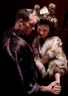
Upon hearing that Matthew Barney created a new movie, and this time with his wife/partner Bjork, I had to see it. Hence, last Thursday I went to Landmark on Clark to see Growing Restraint 9.

Bjork created the soundtrack to the movie, while Barney was responsible for the story and visual presentation. I do not think she wants to be associated with the script, as she usually points out that her focus was on creating music, and not on visual aspects of the film. Overall, the movie was a scrumptious, elating adventure, and the soundtrack fit the film extremely well. Since the film has no dialogue, only for a small conversation in the middle, the music allows the viewer to focus on the visual aspects and the developing story. Apparently, the album to the movie was not liked by Bjork's fans; however, one must remember that its main purpose was to accompany the film and not to be heard alone. Hence, in order to really enjoy this album, one should see Growing Restrain 9.

The Story: Bjork and Barney are guests on a whaling boat. As they arrive, they go through various ceremonial rituals before they meet each other, and their host. The rituals include: bathing, shaving, make up, hair do, being dressed in elaborate animal skins,etc. Once the host arrives,they have tea and a small chat with him (this is the only dialogue in the film). After the host leaves, they remain alone where they begin to portray affection and love for each other through touch, and eventually through stabbing each other in the legs, ripping the meat off, and even tasting parts of their flesh. This part is quiet bloody and gruesome, although, the legs do not look real, however the stabbing is quiet long, and often times it appears as if it will go on forever. As this occurs, the are half submerged in water. At the end of the movie, they turn into whales and swim away from the ship. The movie was very interesting and enjoyable, but could have been a little shorter, as some of the beginning scenes did not make sense (but maybe that's just me). In addition, during the movie there are other events occurring on the ship and surrounding dock. The workers are engaged in building some large metal container,which is later filled in with a white substance, and in the end cut apart; there are children dancing in a procession, several females swimming, and more.

I believe the movie is about creativity, restraint and love, but I might be off. I suggest for everyone to see this movie, if not to see what Barney is about, then to get full enjoyment of Bjork's latest album.

Growing Restraint Website

Movie Reviews:
NYTimes
NYSun
BBCNews
Reuters
Bloomberg

12 April 2006

Another intriguing artist


I love her miniature boxes, something similar to those miniature rooms at the Art Institute. She will have her work shown at r p marshall three studio (1932 s. halsted #507) in Pilsen this Friday, April 14.

Krista Peel's Website

Awsome designs/drawings


I have stumbled upon this guy's work through my roommate, Aga. Hopefully, I will get to meet this guy. He works on paper with ink, then scans in the image, and inputs color into the drawings on his computer. Worth looking at!!!


His websites:
Sebastjan's Design
Sebastjan's Photos

Stuff To Do


As many of you may know, April is a time of Chicago art fests. Here is a list of events worthy attending.

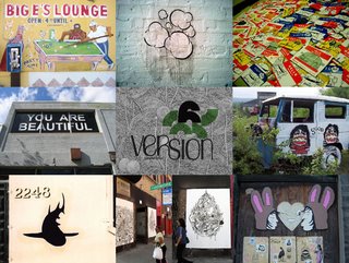
1. Version06:April 20-May 7
2. Nova Art Fair: April 28-30
3. Art Chicago in the Park: April 28-May 1
4. Stray Show (part of Art Chicago): April 28-May 1

It is my understanding that the organizers of these shows are working together in promoting each others events. Version will have an info booth at Art Chicago, and Nova Art Fair will be distributing fliers at Art Chicago. All three events are very different from each other, Version06 being the most radical and fun, while the others are the traditional contemporary art fairs, where galleries from various areas apply for a spot, and have a tent with works by artists they represent. Nonetheless, this will be a great time to see a variety of works ranging from the experimental to the more traditional. See u there!!! If any of you will be attending, and you happen to read this blog, feel free to submit your views and critiques of the fests to me at chicagoarts@gmail.com. I am looking for more interested souls to contribute to this blog, especially if you enjoy writing and critiquing pop and art culture.